Many people spend their day sifting through data, combining multiple data sources, and finally getting data ready for the moment of truth: seeing it in a data visualization. Data visualizations are the culmination of all data crunching work–they’re supposed to take long numeric lists and complicated KPIs, and present them in intuitive, easy to understand way. That is, if you choose the right visualization for your data.
The problem is, it’s often challenging to choose the right visualization for the data you want to show. Do you want to compare values or analyze a trend? What’s the best way to visualize your data so that it is easy to extract insights? Many people stop short there wondering if a chart, graph, or heat map will best reveal the bottom line at a glance, or worse, default to a simple pie chart because that’s what they are most familiar with. But, visualizations need to clarify the information. Defaulting to the most common visualization can actually lead to a misinterpretation of data.
Well, we’ve got you covered: Sisense took our most popular and useful data visualizations and created a guide on when to use them, which data each visualization works best for which data, and how to make it easy to extract insights.
1. Indicator
If you need to display one or two numeric values such as a number, gauge or ticker, use the Indicators visualization. You can add additional titles and a color-coded indicator icon, such as a green up arrow or a red down arrow to represent the value in the clearest way.

2. Line chart
The line chart is a popular chart because it works well for many business cases, including to:
- Compare data over time to view trends (Example: analyze sales revenue for the past year)

- Compare changes over the same period of time for more than one group or category(Example: analyze expenditures of different business units for the past year).Here you just need to simply add a “break by” category.
 3. Column chart
The column chart is best used for comparing items and comparing data over time. The column chart can include multiple values on both the X and Y axis, as well as a breakdown by categories displayed on the Y axis.
 To highlight peaks and trends, you can also combine the column chart with a line chart.

4. Bar chart
Use the bar chart to compare many items. The bar chart typically presents categories or items displayed along the Y axis, with their values displayed on the X axis. You can also break up the values by another category or group.

5. Pie chart
The pie chart is best when you are aiming to display proportional data, and/or percentages. Since the pie chart represents the size relationship between the parts and the entire entity, the parts need to sum to a meaningful whole. Pie charts should only display around six categories or fewer.

6. Area chart
Though an area chart may seem similar to a line chart, the areas under each line are filled in (colored), and it is therefore possible to display them as stacked for better comparison. Use an area chart if you are looking to display absolute or relative (stacked) values over a time period.

7. Pivot table
Pivot tables are one of the most simple and useful ways to visualize data. You can quickly summarize and analyze large amounts of data and use additional features such as color formatting and data bars to enhance the visual aspects.

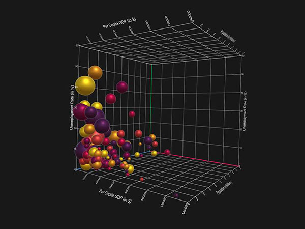
8. Scatter chart
The best scenario to use the popular scatter chart is when you are trying to display the distribution and relationship of two variables. The circles on the chart represent the categories being compared (circle color), and the size or numeric data (indicated by the circle size). A good example is if you are trying to compare revenue and units sold by gender.

9. Scatter map / Area map
A scatter map helps viewers visualize geographical data across a region as data points on a map. You can visualize up to two sets of numeric data using circle color and size to represent the value of your data.

10. Treemap
The treemap is a multi-dimensional widget that displays hierarchical data in the form of nested rectangles. You can use this type of chart in different scenarios, for example, instead of a column chart when you want to compare many categories and sub-categories.

This article originally appeared here. Republished with permission. Submit your copyright complaints here.