Big data is a big deal. But getting the most out of the effort you put into data collection and using it in a meaningful way requires a few things.
Data needs to be organized and presented in a way that makes it easy to comprehend and explore. It should also present information in a way that helps the viewer gain the necessary context to understand what the data actually means. From there, it’s easier to make informed, data-driven decisions for your department, business or institution.
But how can you achieve this? Data visualization! Turning your raw data into visuals – like charts, graphs, and diagrams – can be the key to successfully identifying and presenting opportunities for positive change.
There are dozens of data visualization tools available, all of which offer slightly different features and functions. With so many options, choosing the right data visualization tool can be daunting, so we’ve created a list of platforms to aid you in your search.
1. Tableau
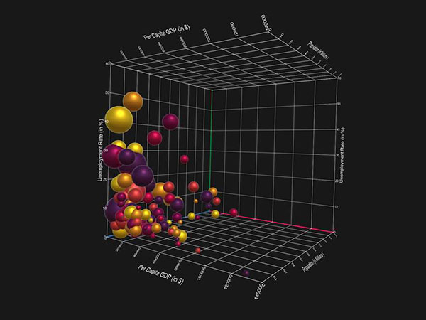
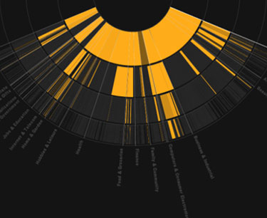
A popular data visualization tool for various industries, Tableau offers multiple products, including Tableau Desktop, Tableau Prep, and Tableau Online. Its capabilities include charts, graphs, and maps, and it’s known for being able to handle ever-changing data sets like those connected to artificial intelligence and machine learning applications.
Is There a Free Version? Tableau offers a 14-day free trial for their desktop version and a free trial of Tableau Online.
2. Precision Campus
Specifically for higher education analytics, Precision Campus is a fully customizable reporting software that is designed to be quick-to-launch. Instead of the typical months or years, it could take for institutions to get started, Precision Campus can get you up and running in days or weeks. It runs on cloud-based infrastructure and is designed to work on desktops, tablets, and mobile devices, making your reports even more accessible for quick visualizations and data-driven decision making.
Is There a Free Version? You can test Precision Campus’ software for free in their demo environment using your own data. You can also request a demo of the full application or sign up for the forever free version of their software.
3. Datawrapper
Popular among news outlets like Mother Jones, Fortune and The Times, Datawrapper’s simple interface and copy/paste functionality makes it a great choice for anyone looking to explore their data visualization options. A CSV, Excel or Google sheet file is all you need to start creating a new chart, graph or map. They also make it easy to embed charts into your website without the need for coding skills.
Is There a Free Version? According to Datawrapper’s blog Chartable, the tool is free to use for occasional users and to test.
4. Infogram
A great option for educators, Infogram advertises its ability to help teach data literacy in the classroom. Students can benefit from learning more about data, how to understand it and how to tell data-driven stories with visualizations. Plus, they can use it by themselves or as a team. With the ability to create a team account and to log into their projects with their Google and social media accounts, Infogram is a great option for the 21st-century
Is There a Free Version? Yes. Their free version offers over 37 interactive chart types, the ability to import data and allows you to create up to 10 projects.
5. Plotly
A great option for those in the financial industry or at larger corporations with developers on hand, Plotly’s product Dash can help you easily create data visualizations like stock tickers. Plotly allows users to create analytic web apps and online charts by uploading a CSV file. Plotly also appeals to developers, who are able to play with and customize the API in languages like JavaScript and Python.
Is There a Free Version? Their community version is free and includes public charts and dashboards, exporting to PNG and JPGs, as well as community support.
6. Sisense
This data visualizer features built-in connectors to dozens of applications and databases, including Google Analytics, HubSpot, Marketo, and Facebook Ads, making it a great choice for marketing teams who need to gather insight from large volumes of data from numerous sources. Sisence also claims to be the first data analytics tool on the market to offer a single-stack solution and their list of sales and marketing customers includes everyone from Rolls Royce to The Salvation Army.
Is There a Free Version? A free trial is available, though their site fails to go into specifics on which functionalities this free trial includes and how long it lasts.
7. Domo
Domo emphasizes its ability to create a digitally-connected organization. With compatibility on any device and cloud storage, this platform could come in handy if your business has multiple offices across the country or globe or has a large number of employees who travel often.
Is There a Free Version? Their free trial is easy to sign up for, though the information is limited on what features are available.
8. Creately
A great option for those who need to visualize data but don’t have data sets to upload, Creately allows users to create visualizations by hand both in an internet browser and on their desktop. Leaning on logic, its editor is intuitive and helps you complete your visualization by predicting what you’re trying to do and choosing shapes and connectors for you. Its drag-and-drop capabilities make Creately easy for anyone to use and that allows an entire team to collaborate in real time on the same visualization.
Is There a Free Version? Their public version is for individual use and limits you to 5 diagrams. After that their plans start at $5 per month.
9. Gliffy
Similar to Creatly, Gliffy utilizes a drag-and-drop functionality and can create different types of visualizations such as floor plans for workspaces and mind maps for brainstorming and idea organizing. Being natively integrated with Atlassian, you can create diagrams without ever leaving apps like Confluence or Jira, which is ideal for web developers and their teams who need to create and share website wireframes and network diagrams.
Is There a Free Version? Yes, Gliffy offers both 14- and 30-day free trial options without having to enter credit card information.
10. StatPlanet
A data visualization software by StatSilk, which is used by government agencies, universities, and non-profits from all over the globe, StatPlanet is completely free to use. With an emphasis on graphs, maps, and visualizations that feature both, StatPlanet makes it simple to filter and explore uploaded data at the same time, aiding in better data-driven analysis and decision-making.
Is There a Free Version? Yes, StatPlanet is free for everyone. Download it here in either the online/cloud or desktop version.
11. Tagxedo
A data visualization tool whose focus is strictly on word-clouds, Tagexdo is a free tool that professional bloggers or social media managers can use to make word clouds in real-time out of anything, from blog posts to new articles to famous speeches. Tagxedo has some great examples of how their word clouds can be used in classrooms or as visualizations in blog posts, reviews or write-ups.
Is There a Free Version? Tagxedo is free for all to use, but you need Silverlight installed on your computer in order for it to work.
12. visualize.me
Great for professionals looking for a way to stand out in the job market, visualize.me is a data visualization tool that transforms your resume data into infographics. Connecting to LinkedIn and collecting your professional experience from your profile, your visual resume can include experience timelines, skills bubble charts, maps and pictograms to get your talents and experience noticed. The option to download your infographic resume as a PDF or word document is also available.
Is There a Free Version? Yes, visualize.me is a free tool. Sign up is easy to do right from their homepage.
13. RAWW
An open-source data visualization framework built on the d3.js library by Mike Bostock, RAWW is a simple visualizer that describes itself as “the missing link between spreadsheet applications and vector graphic editors, using uploaded spreadsheets of data to create a wide range of visual models not easily produced by other visualization tools (including alluvial diagrams, circular dendrograms and streamgraphs).” You can even build your own model if you don’t find one that works for you. Their gallery has some beautiful examples that would appeal to every designer and visualization geek.
Is There a Free Version? Yes, it’s free to use RAWW right from your internet browser.
14. Ember.js
Ember charts are based on Ember.js to create time series, bar, pie and scatter charts whose templates update automatically when their underlying data changes. Designed for web designers with ergonomics in mind, Ember emphasizes its ability to help developers work efficiently to create scalable single-page web applications by incorporating best practices that come from their open-source JavaScript application framework.
Is There a Free Version? Yes. Ember is free and open source, “and always will be” (according to their website.)
15. Google Charts
Not surprisingly, Google, the king of the internet, has its own data visualization tool. Free to use, this tool has the ability to create visualizations like treemaps, scatter plots and histograms. Their charts are based on pure HTML5/SVG and all of their charts are pannable and zoomable. To start a Google chart, you first have to wrap your data in a JavaScript class after loading the Google Visualization library.
Is There a Free Version? Google Charts is free to use and offers instructions and a quick-start guide to walk you through the process of creating your very own visualizations.
16. Sigma.js
– A graph-drawing JavaScript library, Sigma.ja can be used to create mouse- and touch-supported networks to be displayed on the web. It considers itself plug-and-play, with highly customizable rendering settings and built-in features such as Canvas and WebGL renderers.
Is There a Free Version? Sigma.js is free for anyone to download and use.
17. FusionCharts
With over 1,150 chart and map options, this JavaScript charting library helps make a developer’s life easier with everything from detailed guides, API references and open-source plugins for both JavaScript frameworks and server-side programming languages. FusionCharts can also help you build out dashboards made up of custom sets of charts and graphs to give you an overarching view of your department’s data.
Is There a Free Version? FusionCharts is free to use for as long as you want, for development and testing
18. ChartBlocks
Building visualizations from spreadsheets, databases or live feeds, ChartBlocks is a tool that requires no coding using HTML5 and the D3.js JavaScript library. It touts itself as a tool that allows you to build a chart in minutes, making it a great option for those non-developers who need a relatively simple chart quickly. ChartBlocks also features a data import wizard to guide you through the simple step-by-step process and sharing your chart is as simple as hitting the “save and share” button at the end of the wizard.
Is There a Free Version? Their personal account option is free and allows you to have up to 50 active charts, exporting capabilities and 50,000 monthly views.
19. Visually
Unique on our list of data visualizers Visually is a way to outsource your visual content, including data visualization projects. Visually works with a pool of thousands of data journalists, designers and developers and matches you with the right team for your project. If you have the data but no time, experience or resources to translate it into highly stylized visualizations yourself, Visually is a great service to consider.
Is There a Free Version? Because each visualization is created specifically for your project, all work that Visually does will come at a cost. But, you can tell Visually about your project to receive a quote before you choose to use their services.
20. Highcharts
If your data visualization need is interactive charts on web pages, Highcharts is a great tool to try. Used by companies like Facebook, Mastercard, and Nokia, Highcharts uses JavaScript and supports 13 chart types including line, area, scatter and polar charts. Its sister tools include Highstock for creating stock or general timeline charts in JavaScript, Highmaps for interactive map charts and Highcharts Cloud that supports online chart creation with a user-friendly interface with no coding
Is There a Free Version? Yes. Highcharts is free for non-commercial use on personal or non-profit websites.
Now that you have a feel for the options out there, the next step is to dive in and give one of these data visualization tools a try using your own data. For every industry to any level of coding knowledge, from coding custom charts or outsourcing your visualization needs to a third-party designer, utilizing the power of a data visualization tool can give you the power to discover hidden insight, stay competitive in your industry and, most importantly, make smarter decisions for your organization in 2019.