Visualization is critical to data analysis. Data by itself, consisting of bits and bytes stored in a computer hard drive, is invisible. In order to be able to see and make any sense of data, we need to visualize it. Watch these TED videos to get deep insights on Data Visualization.
TED videos on Data Visualization
The beauty of data visualization – David McCandless
David McCandless turns complex data sets, like worldwide military spending, media buzz, and Facebook status updates, into beautiful, simple diagrams that tease out unseen patterns and connections. Good design, he suggests, is the best way to navigate information glut — and it may just change the way we see the world.
The best stats you’ve ever seen – Hans Rosling
You’ve never seen data presented like this. With the drama and urgency of a sportscaster, statistics guru Hans Rosling debunks myths about the so-called “developing world.”
What we learned from 5 million books – Jean-Baptiste Michel and Erez Lieberman Aiden
Have you played with Google Labs’ Ngram Viewer? It’s an addicting tool that lets you search for words and ideas in a database of 5 million books from across centuries. Erez Lieberman Aiden and Jean-Baptiste Michel show us how it works, and a few of the surprising things we can learn from 500 billion words.
The birth of a word – Deb Roy
MIT researcher Deb Roy wanted to understand how his infant son learned language — so he wired up his house with videocameras to catch every moment (with exceptions) of his son’s life, then parsed 90,000 hours of home video to watch “gaaaa” slowly turn into “water.” Astonishing, data-rich research with deep implications for how we learn.
How I hacked online dating – Amy Webb
Amy Webb was having no luck with online dating. The dates she liked didn’t write her back, and her own profile attracted crickets (and worse). So, as any fan of data would do: she started making a spreadsheet. Hear the story of how she went on to hack her online dating life — with frustrating, funny and life-changing results.
Why smart statistics are the key to fighting crime – Anne Milgram
When she became the attorney general of New Jersey in 2007, Anne Milgram quickly discovered a few startling facts: not only did her team not really know who they were putting in jail, but they had no way of understanding if their decisions were actually making the public safer. And so began her ongoing, inspirational quest to bring data analytics and statistical analysis to the US criminal justice system.
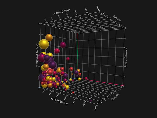
Visualizing ourselves … with crowd-sourced data – Aaron Koblin
Artist Aaron Koblin takes vast amounts of data — and at times vast numbers of people — and weaves them into stunning visualizations. From elegant lines tracing airline flights to landscapes of cell phone data, from a Johnny Cash video assembled from crowd-sourced drawings to the “Wilderness Downtown” video that customizes for the user, his works brilliantly explore how modern technology can make us more human.
Does racism affect how you vote? – Nate Silver
Nate Silver has data that answers big questions about race in politics. For instance, in the 2008 presidential race, did Obama’s skin color actually keep him from getting votes in some parts of the country? Stats and myths collide in this fascinating talk that ends with a remarkable insight.
Turning powerful stats into art – Chris Jordan
Artist Chris Jordan shows us an arresting view of what Western culture looks like. His supersized images picture some almost unimaginable statistics — like the astonishing number of paper cups we use every single day.
The weight of data: Jer Thorp
Jer Thorp creates beautiful data visualizations to put abstract data into a human context. At TEDxVancouver, he shares his moving projects, from graphing an entire year’s news cycle, to mapping the way people share articles across the internet.
Visualizing large data sets: Chris Johnson
Chris Johnson, Director of Scientific Computing and Imaging Institute at the University of Utah, discusses breakthroughs in creating digital visualizations of large data sets.
The best stats you’ve ever seen: Hans Rosling
You’ve never seen data presented like this. With the drama and urgency of a sportscaster, statistics guru Hans Rosling debunks myths about the so-called “developing world.”