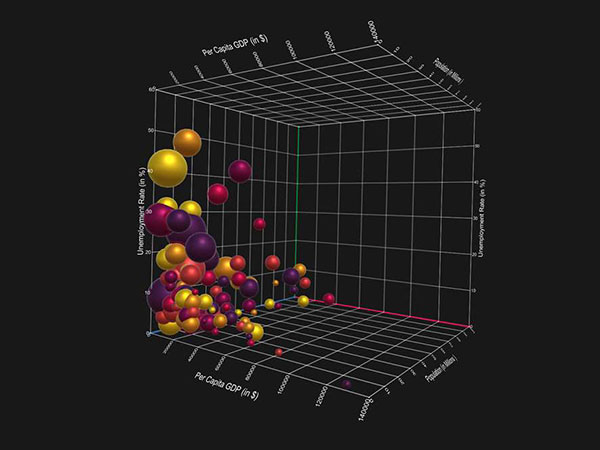
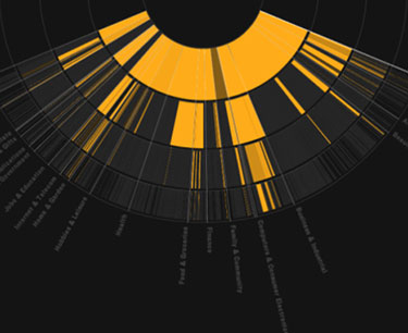
In this era of big data and sophisticated analytics those tortured souls whose job it is to explain and inform have a big problem: How to to make understandable and actionable what the data reveals.
The “traditional” methods of business intelligence (BI) show and tell — a stack of pie charts, some printouts, and a couple of Powerpoint slideshows — really don’t cut it when you’re working with huge amounts of complex data that’s in a constant state of flux. Under these conditions you need a solid framework that constrains and defines the insights you’re presenting otherwise you’ll confuse your audience at best and mislead them at worst.
So, how do you go about maximizing the impact of your BI data? I have an answer for you: Get a copy of Data Visualization for Dummies.
Written by my friend, Mico Yuk, a well-known BI expert, with Stephanie Diamond, an online marketing and strategy consultant, this book starts with the basics such as identifying what data should you be collecting and who your audience will be then walks you through data visualization concepts, the planning and construction of a data viz, and covers an often neglected aspect of visualizations; measuring how users actually use the final product.


