As a remote team, it is often hard to bridge the distance between employees that may very well have miles between them. In a lot of cases, words simply do not cover it. You cannot explain a statistic to your employee using words at least not very well.
This is where data visualization comes in. Data visualization is the concept of taking data and putting it into formats like graphs or maps which make it easier for the brain to understand.
So, for example, instead of mentioning how sales decreased over the year by 13%, you could use a graph to put your point across even better.
You are essentially transforming raw data into a visual format to better showcase the information at hand. This is especially important for remote teams where communication might be an issue.
In the words of Dan Radigan, “When transitioning to a distributed culture, err on the side of over-communicating. Communicate even minute details until both offices find a healthy groove…..Even teams within a single office can benefit by operating like a distributed team.”
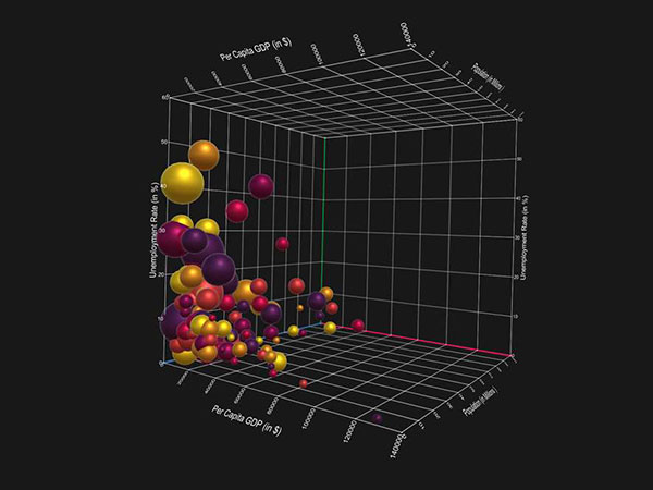
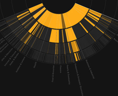
Types of Data Visualization
So there are a few main data visualization elements that are considered the most common and knowing the various types will help you better understand what might be suitable for your remote team.
These are a few ways you can represent your data remotely-
- Line Charts
- Bar Charts
- Graphs
- Pie Charts
- Graphs
- Maps
- Infographics
- Heat Maps
- Dashboards
- Timeline
- Treemap
This will frequently be paired with project management tools that are either manual or automated ways to showcase data visually.
Data Visualization Best Practices
Data visualization can be a boon to your company helping employees reach higher targets, helping managers create better connections with their team, and helping the company make more money online by bridging the distance.
All of this eventually contributes to organic business growth for the company on a whole which means optimizing your data visualization process can take you far. Here are a few things to keep in mind-
Be Brief
There is such a thing as diving too deep into the data which means losing your team members along the way. A general overview of the raw data is normally what your team members are looking for.
A good example of this in action is what InfiniteRecovery, a Texas Drug Rehab center, is doing to show their team members a general overview of their 8 step process.
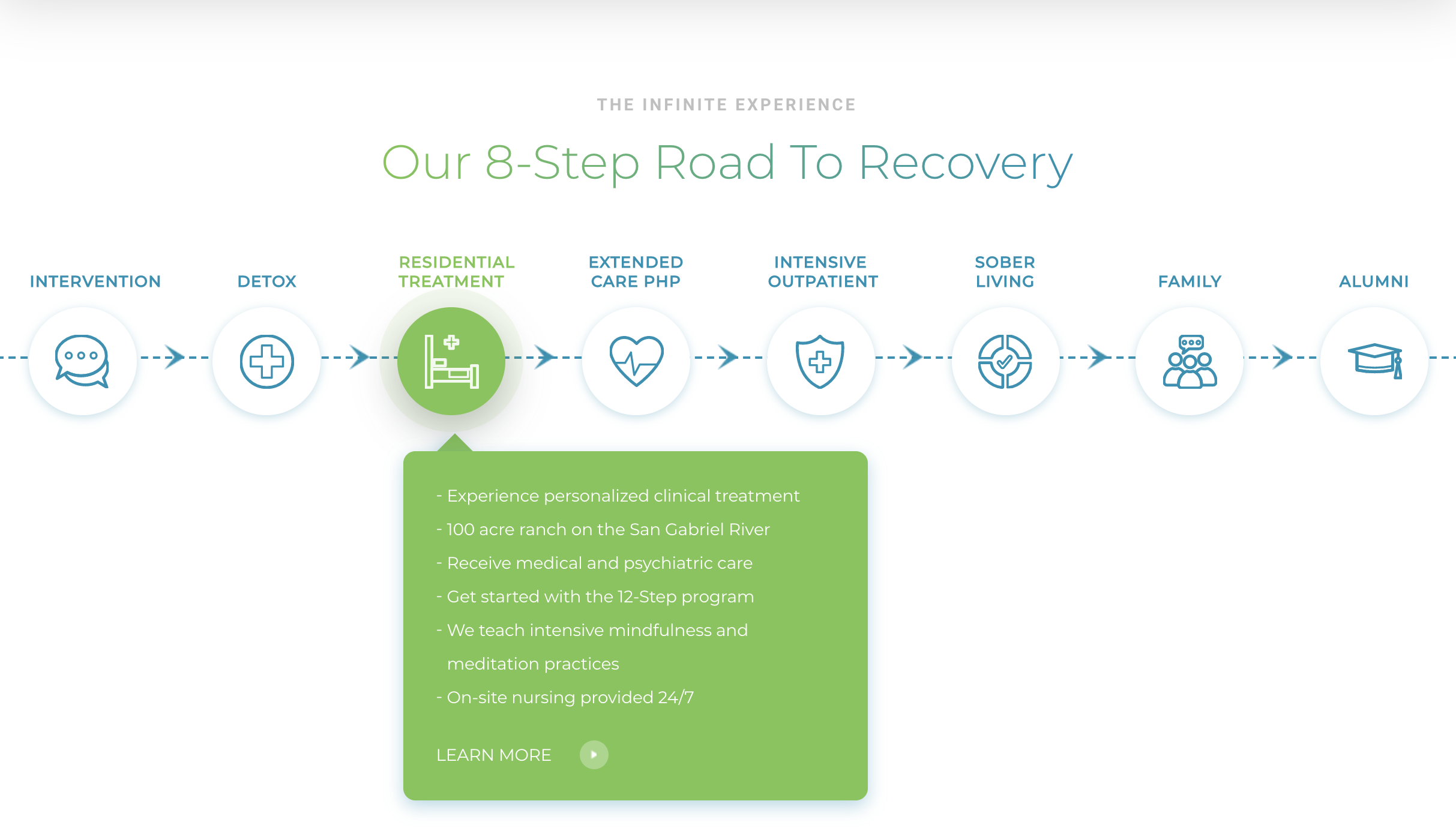
This simple but ‘straight to the point’ visualization not only helps everyone in their remote team to keep an overview of the entire process, but also helps potential new customers to understand their products and services even better.
Remote teams in particular sometimes find it hard to stay on the same page. Remember that the whole aim of visualization is to bridge the communication gap. A summary of data or a dashboard with recent performance trends might be exactly what is needed.
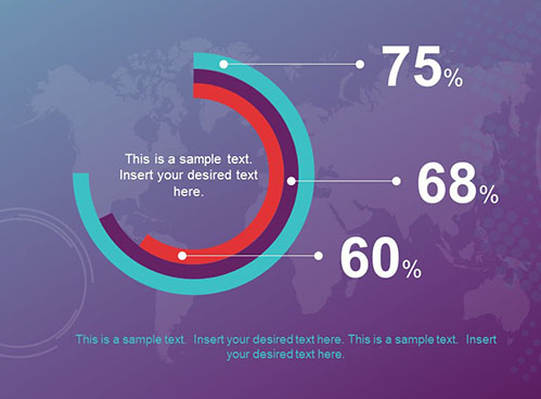
A Splash of Color
A good color palette can be used to draw attention to the important information at hand. If you have created a beautiful heat map or graph, color is a great helping agent when explaining the meaning behind the data.
Use Indicators
Indicators are used to point out the most important information and create a kind of hierarchy of your data. This will help your team better understand how to digest the data by giving them an organized way of looking at it.
Examples of Data Visualization In Action
We have covered the ‘What is Data Visualization?’ question which means we can now move on to a couple of examples. Keep in mind that the primary aim of data visualization is to be able to break up an abstract thought into smaller pieces to make things easier to understand.
The Kanban Way: Visualize Progress on Trello
Kanban boards are used to visually represent projects at various stages using cards on the board.
The boards help you visualize your workflow by placing each project into one of a couple of phases. The aim is to create a workflow that you can then add projects to depending on where they are in the process. It should look something like this if you are using the Trello project management software–
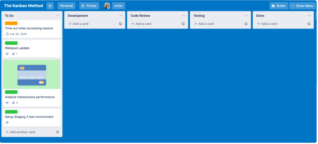
You can then use a power-up like Kanban analytics to analyze the data you have and visualize how well your workflow is performing. This type of data visualization works best for remote teams that are managing things like content, new releases, multiple projects, and more.
For example with content creation, you could have lists for blog post topics, keyword research, author of the post, due date for the draft, publishing date, etc. It is essentially a way to make sure your company’s multiple workflows are all running smoothly.
It gives everyone a step by step workflow to use as their foundation and the analytics tab helps managers spot any spikes or drops in performance trends so that they can smoothen out the process further.
Cloud ERP Software
As work continues to become more distanced, multiple industries have begun to depend on cloud ERP software that allows them to plan for resources they might need by booking orders, managing quotations, making deals, etc. via the internet.
Food manufacturers, seafood manufacturers, and medical equipment manufacturers are frequently in need of dependable ERP software.
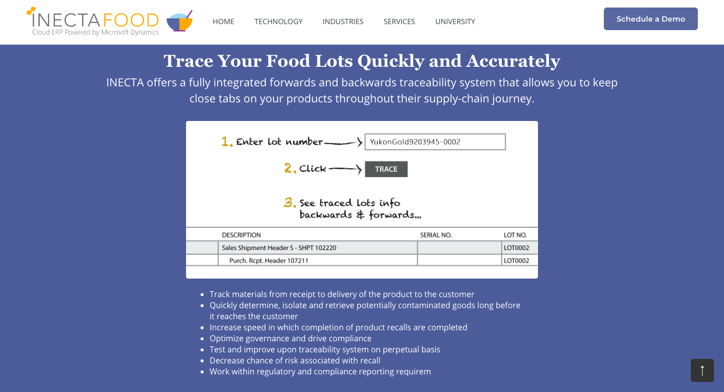
iNECTA is a great example of a cloud ERP software that benefits multiple manufacturers across different industries. They offer resource planning software for food, seafood, process, and medical equipment manufacturers that allows the tracking of materials straight from receipt to delivery, the isolation of contaminated goods, and the tracing of pretty much any package.
This type of software helps you connect various departments in the manufacturing process straight from the warehouses to supplier management before eventually moving on to the transportation management of your goods.
It is a streamlined and automated way to make sure you are producing, supplying, and transporting your goods without any hiccups along the way.
Data Visualization Through Video
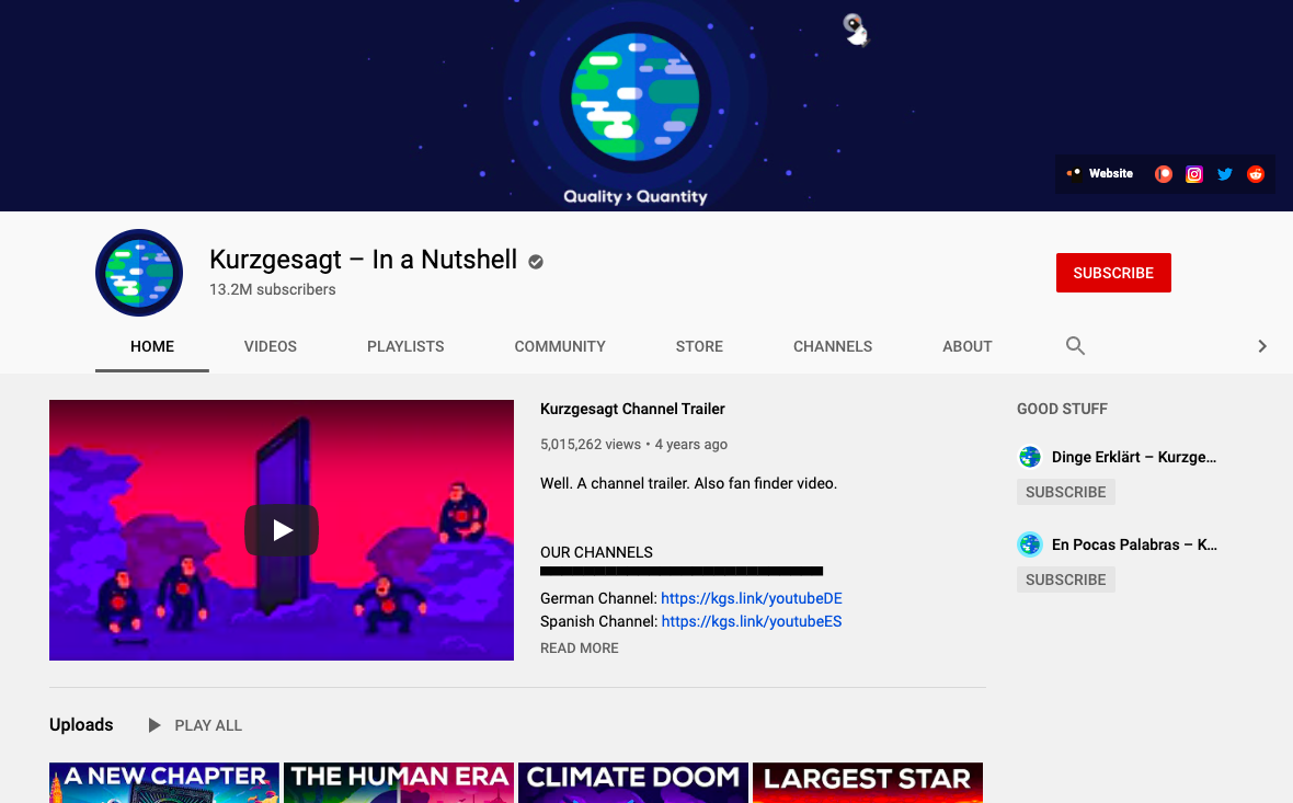
Data visualization is not only limited to boring charts and graphs. You can also take a deeper dive into data using video as your aid. The YouTube channel Kurzgesagt – In a Nutshell does this with every topic they cover whether that is a complex concept topic like resources from space or something much deeper like humankind’s existence.
Video can explain a concept like nothing else because it immerses you in the data. You can use this same idea when you are creating a webinar or starting a blog– the inclusion of data in video format can help get your point across better and keep viewers engaged longer.
Wrapping It Up
Data visualization can be an informative way of getting dull data to literally jump off its page. You can even use interactive data visualization software to better explain and analyze the data.
Putting your most important information in a visual format such as a graph or map can help your organization consume the data better and gain valuable insights from it.