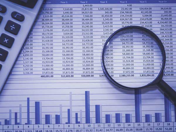
Data Visualization is an art of presenting data in a manner that even a non-analyst can understand it. A perfect blend of aesthetic elements like colours, dimensions and labels can create visual masterpieces, hence revealing surprising business insights which in turn helps businesses to make informed decisions.
Data Visualization is an inevitable aspect of business analytics. As more and more sources of data are getting discovered, business managers at all levels embrace data visualization tool in order to analyze trends visually and take quick decisions.
It also allows data scientists to converse with their end users, because most of the times, the outcome of data analysis may not be immediately comprehensible to the people who do not directly deal with data. Data visualization bridges that gap and makes people appreciate the possibility of the data analysis.
Tableau
Tableau is a Business Intelligence tool for visually analyzing the data. Users can create and distribute an interactive and shareable dashboard, which depicts the trends, variations, and density of the data in the form of graphs and charts. Tableau can connect to files, relational and Big Data sources to acquire and process data. The software allows data blending and real-time collaboration, which makes it very unique. It is used by businesses, academic researchers, and many government organizations for visual data analysis. It is also positioned as a leader Business Intelligence and Analytics Platform in Gartner Magic Quadrant.
Let’s make our hands dirty and make some visualizations!!
The following table tells you how to choose the right visualization for your dataset out of many available options.

We are going to work upon Amazing mart dataset to make different types of plots and to combine them using Tableau.
Let’s load data into tableau!!

After loading data, check out the information present in the file and check what we must do. Our aim is to create plots and combine them together.
Let’s join the sheets present in the dataset. By default tableau picks inner join by taking common key between files.

Just drag and drop the sheets or click on the sheet name to join them. After making the join, let’s make some visualizations. Go to sheet1 to see what tableau made using this data.
Make a line chart using Tableau
Drag order date to Columns shelf and you will see by default it will show a year there is plus icon if you press that it will convert that year into quarters, months, weeks and days according to requirements. Here in this plot we are considering months. We are plotting line chart between months and Sales.

We can change this line chart into different charts by going into marks shelf and changing automatically to some other type of a bar chart.

Let’s make a plot showing same data for different categories.

Combining Plots
When working with multiple measures in a view, you can customize the mark type for each distinct measure. These measures can be displayed as individual axes, blended axes, or dual axes.
Because each measure can have customized marks, you can customize the level of detail, size, shape, and colour encoding for each measure too.
Here we are combing targets measure into a plot to compare how the company is performing.
If we see below graph it is showing two different plots in one plot which giving insights about sales and targets achieved by each category.
But it’s difficult for us to compare which category is doing well. Using Tableau we can make it very much easy to visualize and get which category is doing well.

Dual Axis Plot
Dual axes are useful when you have two measures that have different scales.

Mouse over to axis and right click we get a menu and select the dual axis to merge this both plots.

If we see here both plots merged but if we see the axis on either side it’s not same and it will be difficult to say which category is doing well. So synchronize this axis using menu when we click right mouse click on axis.

This shows dual axis plot and through this we can predict which category is doing well.
Another example showing a combination of plots.

We can combine different plots like line and bar chart, many other combinations according to the requirements.

Conclusion
Tableau is the richest data visualization tool available in the market. Tableau provides flexibility to users to make great insights using drag and drop functionality. There are so many more insights that can be unlocked from the data we have. Explore more by combining diverse types of plots. Practice more to be perfect.
This article was written by Juturu Pavan, Chaitanya Sagar, and Saneesh Veetil of Perceptive Analytics, which provides data analytics, business intelligence and reporting services to e-commerce, retail and pharmaceutical industries. Its client roster includes Fortune 500 and NYSE listed companies in the USA and India.
