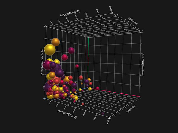
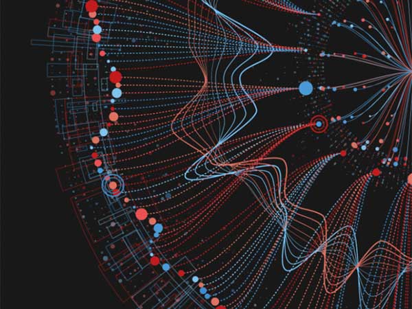
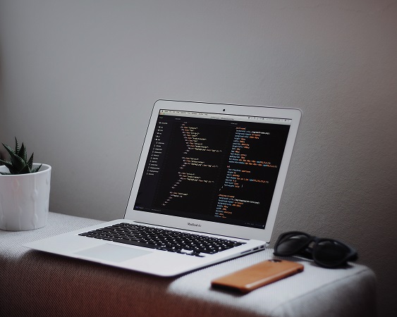
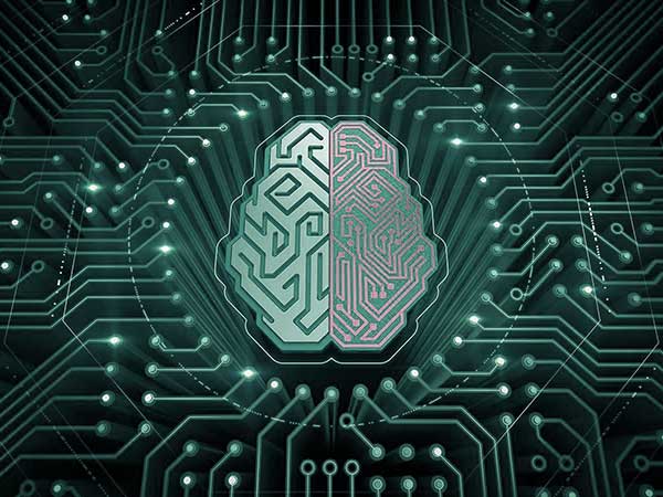
The practice of using information, or data, is nothing new, but technology has revolutionized how we collect, store and present that information. With the help of powerful data analytics and visualization tools. Some of these tools, such as IBM’s Many Eyes, are already exploring the power of AI to automatically organize and understand data, offering even more data-driven decision-making power to businesses and institutions all over the World.
But we now know that the data alone is not enough. It is how it’s presented and organized that makes it so powerful when it comes to making better decisions. The way that the human brain processes information should be taken into consideration when preparing reports and data sets that will be presented to decision-makers. The brain prefers visual, easy-to-digest information, as it makes understanding the relationships between each batch of data easier.
With the help of big data and analytical tools made specifically for higher education data, colleges and universities are adopting data-driven decision-making practices to improve student success, persistence rates, resource allocation and more. Data analytics software could be just the tool you need to present informational reports in the right way to the right people in order to successfully encourage change and get things done.
What is big data in higher education?
“Big data” is a term used to describe the immense amounts of data that is constantly generated and recorded in the digital age — and in the field of higher education, big data can include everything from student demographics, such as gender and ethnicity, course data like enrollment and persistence rates, and resource allocation like building and electricity usage.
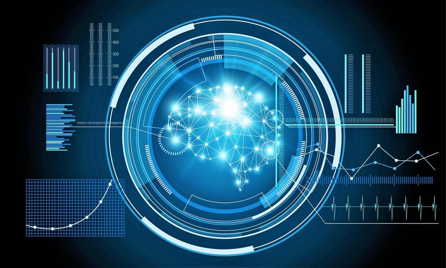
By detecting trends in big data, it’s possible to develop context and create a visual story to predict what may happen in the future. And by presenting this data with the assistance of data analytics software — which can translate your stats and numbers into easy-to-digest charts, graphs and visualizations — you can increase the chance that your institutional leaders fully grasp what the data is saying and what they can do to adjust procedure and program plans to make your institution successful.
Here are a few simple ways higher education can put data visualization to work.
Gain student perspective to improve persistence rates
Does your engineering program see an excessive number of dropouts between the fall and spring semesters of junior year? Are working students inevitably unable to balance schoolwork with their job responsibilities? Creating a Persistence Rate report helps higher education institutions identify and understand which challenges their students may be facing, and could help put into perspective why they discontinue their path to a degree.
Powerful data analytics software like Precision Campus, are specially designed for higher education data sets and can help you create a unified view of your institution’s data. By helping to identify these trends and evaluate these areas of concern. Beyond creating specific reports, this data is also easily transformed into visuals such as flowcharts or Venn diagrams, which programs like Creately offer in their free versions so you can try before you buy to make sure it holds value to your bottom line.
Report on course success rates
How do you know if your curriculum is effective? What makes a student continue on to the next semester? Course success rate data are ways you can gather the context you need to answer these questions. If certain sections of ENG 120 have high dropout rates, use your data to dig deeper. What do the unsuccessful sections all have in common? Are they held very early in the morning? Are they all being taught by the same professor? These are all questions you can answer by collecting, organizing and analyzing the right institutional data with the assistance of data analytic tools.
After you have collected this data, presenting it in the form of a Course Success Rate Report will show the commonalities between these factors and can be presented to department heads so solutions can be discussed. From rescheduling, removing or adding waitlists for courses to offering popular or required courses online to satisfy the growing demand for online education options, using the data from your students’ journeys from course to course in any given program will help department heads make better decisions for your institutions and students.
Report on the use and optimization of resources
Wasted resources, from electricity in unused classrooms to your faculty’s time, can add up to a pricy way for an institution to come up short. Looking at your data, you can find courses and sections that are failing to reach targeted requirements or goals and present this data to leadership. Tools like Gliffy offer pre-built diagram templates, making it simple to visualize data and present it to leadership with little to no assistance from your IT department or a data professional.
With these diagrams, it can be decided if your institution should offer certain sections every other semester or relocates classes to different rooms or buildings to save on power resources. For example, knowing a building will be empty on Fridays after 2:30 p.m. could alert you to turn the heat down for the weekend. There are many other ways that your institution could save resources and money by re-evaluating the use of your buildings and re-arranging course times and availability.
Big data analytics for higher education gives institutions the context necessary for understanding their students, staff, and campus on a much deeper level. However, interpreting big data in a way that inspires change starts by using the proper infrastructure and presenting mass amounts of data in an easy and actionable way, which an investment in higher education data analytics software could help you achieve.