Data has grown increasingly complex over recent years, thanks in no small part to computers becoming fundamental to how all businesses work. This has its positives, as the more data and metrics a company can work with, the more performant and reactive the be.
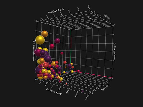
The real problem is that many people are very visually-oriented, meaning a wall of text, numbers and technical terms simply aren’t all that digestible, even to people who understand what all this information means. Thankfully, people long ago mastered the creation of charts, graphs, tables and spreadsheets to intuitively represent data in easily-digested ways.
These were in fact one of the biggest driving innovations in the advancement of office software at the dawn of the computerized office, and this refinement and evolution haven’t stopped since. You’re probably all too familiar with the creation of these charts and graphs, if you’ve spent any time working in a modern office.
Sadly, you’re probably also familiar with those colleagues in your department who’re bad about providing needed visualizations, or, let’s be honest, just don’t do a great job.
This can result in one member of a team being saddled with producing all of the visualizations. Not only is this inefficient and unideal, it can also result in a lot of errors. If one person gets stuck handling all of this, they may be working with data they don’t entirely grasp, especially in situations where some specialism is present.
In other words, making sure your entire office is on the same page about data visualization is very necessary, and is only going to be more so in the future. Perhaps it’s time for your entire department to stop, take a breath, and collectively look at modern best practices for data visualization.
1. Agree on a Methodology
Establish a routine for how data visualization is produced by everyone involved. Standardize your data acquisition process, visual schema and design parameters and adhere to these pretty strictly. This will ensure consistency in all visualizations, and the target audiences will become accustomed to reading them easily.
2. Understand Your Audience
Data isn’t processed the same way by everyone, and the data present may mean different things to different people. Know who your audience is, and what their occupations are. This will allow you to design your visualizations in a way that makes the most sense to them, and presents the data everyone needs.
3. Determine the Desired Outcome
Presenting visualized data is something of a call to action. Know in advance what reaction you are trying to evoke from those whom will be reading it. For example, if you want to indicate status quo, you’ll be aiming for little to no reaction. If you’re conveying positive gains, you’ll want to evoke a positive reaction.
4. Use classification
There is more than one type of visualization, and each one serves a very different purpose. For example, an operational design is intended to show the various metrics involved in regular operation of one or more business processes. Strategic visualizations are used for planning actions or reactions to situations, as well as to plan the implementation of change. Analytical visualizations provide logistics and statistics often important to those working in the company’s financial departments.
5. Use Profiling
Be sure to profile your data in logical ordering that makes common sense to everyone. This is a common pitfall in visualization, especially when it’s coming from someone to whom this has often been an afterthought. Be sure to categorize your data, putting stuff together that belongs together. Be sure to order data in a common, sequential manner of increasing or decreasing the value. Finally, be sure to be as quantitative as possible, conveying the value of the given metrics sampled in the visualization.
6. Use visual Elements as Intended
Sometimes, people like to get a little too creative, and have a tendency to be a little too artistic with how they implement visual elements in these documents. Consider the way the human brain processes a visual – which direction will the eye scan? This is known as eye tracking in UX, and it’s just as important here. Ordering elements and data in an ordinal fashion that follows this flow is imperative.
7. Fail Faster
A common term in recent years is “fail faster”. This is most commonly used in various development environments, meaning “prototype, test and try again as often as possible”. This is applicable to data visualization, though it can be tricky and even seem disparaging to cope with. Don’t spend too much time trying to get your visualization practices to a 100% success rate before trying them out on your target audience. Prototype them, get input on readability, and apply the process to real use in the meantime. This is called iterative design.
It all seems pretty straightforward when you sit back and look at it, doesn’t it? Understanding your audience, your corporate culture and human nature as a whole is the key to proper data visualization. Fortunately, once you understand these principles, it’s very easy to enforce them relatively effortlessly with the modern, more intelligent office software commonly in use.