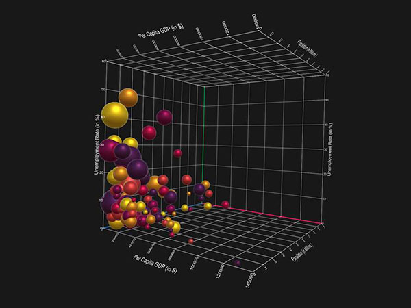
At its core, data visualization is a simple concept – it involves taking data and presenting it in a graphical format, either in the form of something like a picture or a graph or an Infographic or a combination of all these techniques and more.
It’s an idea that has been around since the 17th century and one that has big implications for marketers in particular.
With the right data visualization tools at your side, marketers are able to accomplish things like:
- Get a deeper understanding of what factors are influencing consumer behaviors and buying patterns.
- Predict sales volumes based on historical trends and patterns.
- Gain insight into which products will do well in which markets.
- Identify areas of operation, both in terms of marketing and sales, that either needs attention or could desperately use improvement and so much more.
But data visualization is about a lot more than just taking a set of numbers and turning it into an image. It’s about taking concepts and ideas – some of which are incredibly complicated and sophisticated – and presenting them in a way that nearly everyone can understand.
It’s also the direction that nearly every industry is headed in, extending well beyond the world of marketing and into just about every part of our lives that you can think of.
The real world impact of Data Visualization
One of the most interesting (and essential) was that data visualization is already being applied in the real world has to do with our infrastructure. The Office of Cyber Infrastructure Analysis at the Department of Homeland Security, for example, is already in the process of developing computer modeling and data visualization tools in an effort to better understand not only how the various elements of the country’s infrastructure operates, but how they all come together to form a cohesive whole, the properties that those connections are built on and what happens in the event that they fail.
To that end, OCIA regularly uses data gathered from a variety of different sources to anticipate what various “malicious and non-malicious” events (meaning everything from a terrorist attack to a hurricane) would do and what actionable steps can be taken today to mitigate tomorrow’s damage.
Over the last few years, OCIA has been creating a data visualization infrastructure model based on public data about an area of northern New Jersey, taking a close look at the current state of the area’s water system.
Once that data was visualized and officials could see not only how the individual systems were connected and how they all depended on one another and in what ways, they instantly got a very clear indication of the types of disruptions they just were not prepared for.
This, in turn, led to a number of immediate changes to improve these systems, none of which would have been possible without data visualization and data sharing.
In the end, this type of data visualization does something that a PDF file never could. It allows people to not just consume information but to really test it, understand it, interact with it and process it in an honest and insightful way.
Data visualization is nothing if not interactive – it draws out the story hidden beneath the numbers and allows a compelling narrative to form that helps people make actionable, informed decisions moving forward.
Tomorrow’s data sharing world: Infographics and beyond
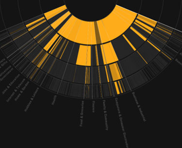
While it’s true that in terms of marketing professionals, in particular, this type of large-scale data visualization is a long way off, there are still techniques you can use to achieve many of the same end goals using the technology available today. If you’re looking for a visual way to present data that is compelling, easy-to-understand, engaging and interactive, a well-designed Infographic checks all of those boxes right now.
Visme, for example, is a purpose-built data visualization tool that lets you effortlessly create Infographics, presentations and more, all of which can be custom built to play to the needs of the audience you’re trying to attract. The format itself is so powerful because it presents ideas with a level of approachability that instantly helps to communicate your message. It cuts through all the noise and offers an immediate insightfulness that helps create an emotional response in your readers.
They’re also incredibly efficient conversation starters that allow you to both create the conversation that will be taking place and drive it in the precise direction you want it to go in.
All of this is possible because Infographics and similar types of content like presentations are built on the very properties that make data visualization so successful in the first place. They’re perfect branding tools, which is especially helpful for marketers trying to increase their level of referral traffic. According to Hubspot, they also:
- Help grow traffic as much as 12% faster.
- Are 30 times more likely to be read than a text article, even when both pieces of content present the same message.
- Are inherently convincing. According to a study conducted by the Wharton School of Business, two presentations were shown to an audience – one with data visualization techniques like Infographics and one without. The visual presentation convinced 67% of the audience of the point the researchers were trying to make, while the verbal presentation only convinced 50%.
Data visualization: The path to the future begins now
The brilliance of data visualization is very much in its simplicity – in more ways than one. By taking advantage of the fact that humans are visual learners in the first place, data visualization can help us do everything from make our marketing campaigns dramatically more effective to literally improve our communities and our lives in immeasurable ways.
Make no mistake: this is an essential idea, but it’s still one in its early stages.
We are at the precipice of something incredible in terms of what tomorrow’s data-driven visualized world will look like the Infographics of today are only the beginning.