People are able to process visual information much faster than textual content. For this reason, data visualization is an essential model of contemporary business intelligence. There are hundreds of techniques to present business-related information and sometimes it might appear challenging to find the best one for you.
In case you are running out of time, you should understand the basic data visualization tactics and keep in mind the catalog of charts, graphics, and diagrams. Luckily enough, you can count on our help in that regard. In this article, we will describe the top 5 best data visualization techniques.
Best Data Visualization Tactics
Data visualization can communicate complex information in a way that is easier to interpret by turning information into visually engaging images and stories. It enables you to highlight the most relevant conclusions from what would otherwise be considered a huge pile of worthless documents.
But what is the way to approach data visualization? What are the most efficient techniques? Let’s take a look at the 5 best models here:
-
Get to know the audience
The age of IT and Internet as we know it seems to last forever but don’t forget that it is still in its 20s. On the other hand, data visualization is even younger than that. A lot of people – even entrepreneurs – don’t know how to read more than a simple chart or pie. That’s why you need to understand the target audience and adapt the presentation so as to match their IT literacy.
Lucille Neely, a digital marketing specialist at Best Dissertation, explained it concisely: “If you are dealing with inexperienced clients, stay away from advanced solutions. But if you are meeting highly skilled professionals, going beyond pies and charts is mandatory”. Therefore, you must get to know the audience you face and give them materials they can digest successfully.
-
Think about the content
What you want to present is as important as who you are showing it to. There are 4 basic ways to approach data visualization:
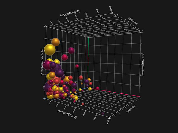
– Relationships: Shows the connections and mutual impact between specific elements (such as education level and average income). Scatter plot is the best choice in this case.
– Timeframe: Line graphics suits perfectly if you want to show how certain phenomenon is developing over time.
– Composition: This technique is developed to reveal the structure of a single unit, showing its constitutive elements. A pie chart is the simplest way to do this but if you want a more distinguished data visualization, go for the 100% stacked horizontal bar graph or a slope graph.
– Comparisons: Bar charts are the usual suspect if you want to compare two or more values.
-
Mind the colors
Although it seems irrelevant, the colors you choose will strongly impact the overall effectiveness of your data visualization model. You should keep 2 things in mind here: color consistency throughout the documents and the contrast.
First of all, you should make contrasts between the opposing elements, emphasizing the differences among these features. People mostly use red, green, blue, and yellow because they can be recognized and distinguished easily.
Secondly, you should not mix the colors too much because it creates confusion among viewers and interferes with already established patterns. For example, if you used red to mark negative trends and green to highlight positive outcomes, don’t change the style throughout the document.
-
Use interactive maps
Data visualization can become a source of valuable digital content, which demands adding interactive elements to the presentation. Interactive maps play the major role in that regard because they allow users to engage and look only for information that they really need.
Interactive maps enable users to wander around the chart, zoom in and out, identify special elements upon click, get a 360-degree overview, and many other interesting features. Creating such maps is a highly complex process but it will definitely leave a great impression on your clients or customers.
As the matter of fact, interactive maps had already become a standard technique for the vast majority of companies and websites, with the likes of Google, Booking.com, or National Geographic setting a good example for data visualization community.
-
Use digital tools
There are dozens of incredible data visualization tools available online. We strongly suggest you use some of these programs to create custom tables because it’s the only way to impress your clients in 2018. Here are our recommendations:
– Microsoft Power BI: This app is easy to use and extremely intuitive. It is available in free version, so you can give it a try before deciding whether to conduct the purchase.
– Zoho Reports: The tool has tons of beginner-friendly features but also a lot of advanced possibilities, which makes it suitable for all levels of expertise.
– Chartio: Chartio is difficult to learn but very good for data visualization professionals.
Conclusion
Data visualization can help you to create better and more appealing business reports, maximizing the potential of your analysis. If you want the attention of your clients and colleagues, you need to learn modern data visualization models to improve the quality of your presentation.
In this article, we showed you top 5 best data visualization techniques for 2018. Give our tips a try and don’t hesitate to leave us a comment if you have more suggestions to share with our followers.