In today’s age of information, data is undeniably one of the most important factors for ensuring your business’ growth. Big data is transforming the world of business as it can simplify the process of finding new opportunities by giving valuable insights from data. This enables you to make improvement in areas from customer service to sales.
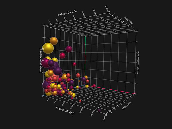
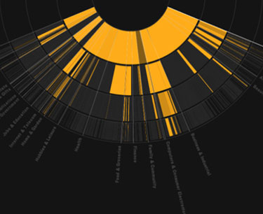
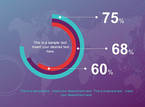
Big data visualization involves the presentation of data in a format that makes it easier to understand and interpret. Turning data into pictures makes it much easier for decision-makers to take in the data at a glance and understand what the data has to say.
If you’re eager to adopt big data visualization and recognize the benefits of using it for small business, turn to these eight mobile apps so you can start making better business decisions today!
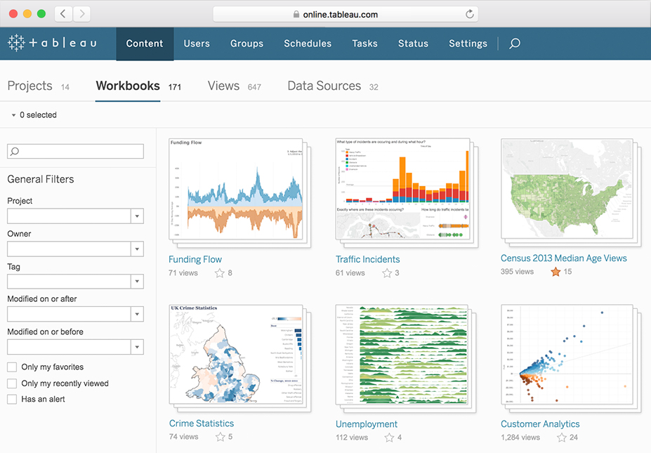
Tableau
This business intelligence software is one among the market leaders for big data visualization. It’s easy to use and with its intuitive drag and drop interface and fast analytics – Tableau is 10 to 100 times faster than competing solutions. Tableau allows you to combine multiple views of data for richer insight and sharing a dashboard on mobile devices or live on the web is just a few clicks away.
SAP BusinessObjects
If you want your business to become a digital enterprise, you need to learn more about SAP BusinessObjects. This app will allow you to thrive in the digital economy with real-time insight and gives you the ability to make data-driven decisions. You’ll also empower your sales, finance, HR, operations and marketing teams to make smart, collaborative decisions.
Google Chart
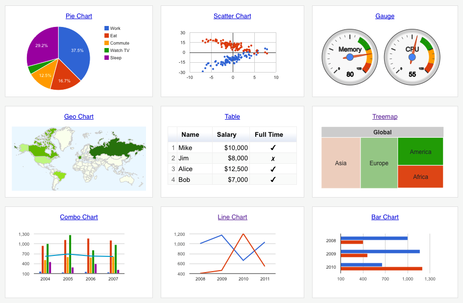
It’s no surprise that Google is a leader in the big data game. Their Google Chart product is an easy to use visualization tool for large datasets. The product offers an extensive gallery of chart options from simple line graphs to more complex graphs like hierarchical tree charts. Google Charts allows you to customize the charts to help you more easily understand the data.
The charts are rendered in HTML5/SVG format making it cross-browser and device compatible. In today’s global marketplace, giving access to data visualization on the go is a requirement for every enterprise.
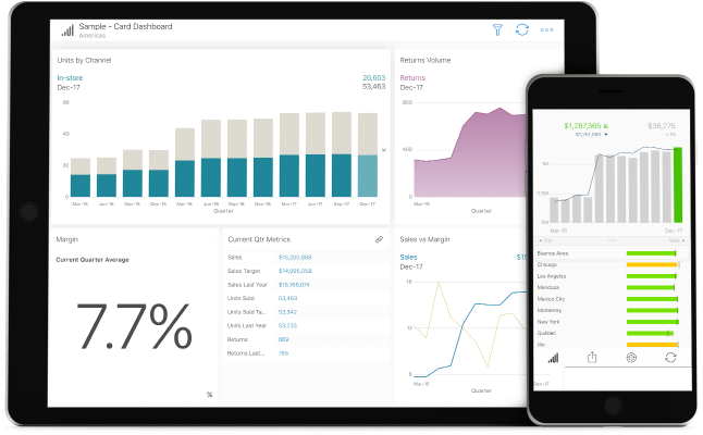
Roambi
Roambi is a mobile-centric analytics and data visualization web app that redesigns the way people use business intelligence. This app offers access to self-service business intelligence tools and the ability to consolidate data from multiple sources in a single app. Bring your data to life for consumers with quick and easy mobile access users can turn to on any device, from any location, at any hour of the day. One key benefit of Roambi is the quick and intuitive ability to access and share information across an entire enterprise. Using Roambi, you can create insightful and dynamic presentations that include data visualizations and take your business to the next level.
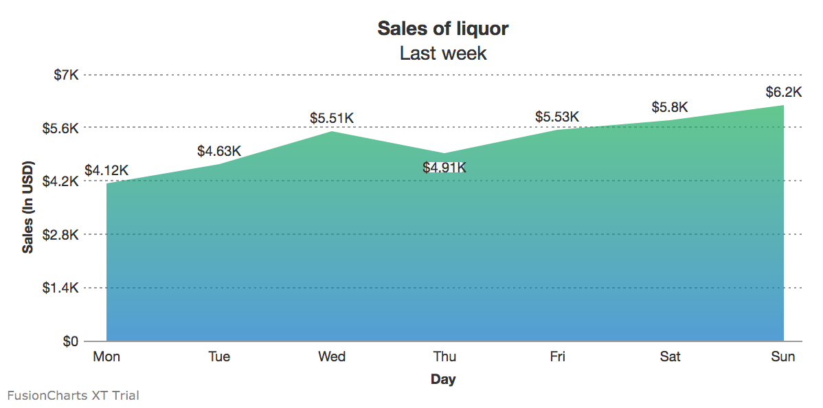
FusionCharts
FusionChart is a charting library made using Javascript for the web and mobile devices. They boast 28,000 customers across 118 countries who are using their data visualization products. Their clients include Intel, Microsoft, Google and more. The product provides more than 90 2D and 3D chart styles with a good number of functionalities such as animation, panning, and scrolling. They also offer apps for Android, iPhone, iPad, and Windows.
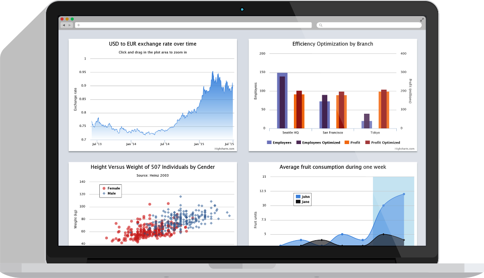
HighCharts
This is a great tool for teams who are proficient in Javascript. The HighChart charting library is written totally in Javascript and uses SVG, VML and HTML5 to render charts across various browsers and mobile devices. What sets this tools apart from some others is its ability to process real-time JSON data and display them in the charts each user wants to see them in.
Qlik
You probably realize that you use data analytics to boost your business. Many people turn to Qlik for data visualization tools that allow users to analyze data with ease. This app allows you to create interactive reports and dashboards with spectacular graphs and charts. The software and discovery tool simplifies data analysis so you can make well-informed business decisions in less time than ever before. Qlik also offers a drag and drop interface for ease and the app’s Smart Search feature can help you uncover relationships within data. You can also explore various data sources in this single app – one reason why Qlik is trusted by more than 45,000 customers around the world.
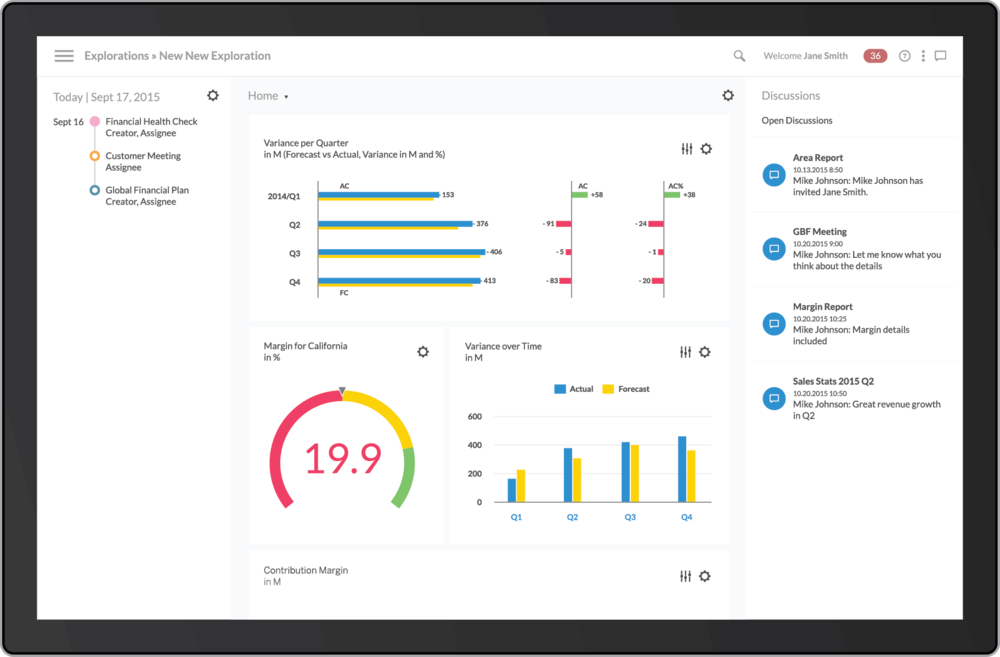
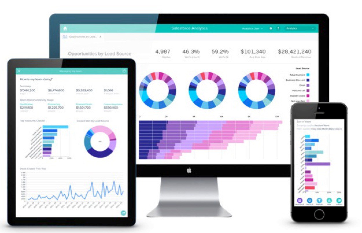
Salesforce Einstein Analytics
Originally designed as a mobile-first approach, this app also works on smartwatches. Its focus is on mobile collaboration and offers embedded dashboards. The mobile app allows you to work with data files and create easy to read charts, graphs and other pictorial representations of data. The platform helps users understand the key parts of the business with a few easy clicks and no training in data analysis.
Big data visualization is essential to embrace as you work to grow your business. When the flow of raw data is represented with images, it’s much easier to make confident decisions. Make sure the tools you use have the capability to apply filters to adjust your results, provide collaboration options for users and have the ability to process multiple types of incoming data. Find the tools that work best for you, so you can start making decisions that drive value and better your business.