Writing about data is not the easiest task that ever befell a wordsmith. Data is necessarily intangible. It’s a cluster of information that can communicate a concept if perfectly arranged. On its own, data doesn’t have a voice. It’s just points of information. As a writer, you make data tell a story. Like the great pointillist painters, you can create a concept in someone’s mind from isolated points of data. But to do this well, you’ve got to make your writing interesting and educational. Here are three ways to do just that, even regarding information as diffuse as data.
Use real images
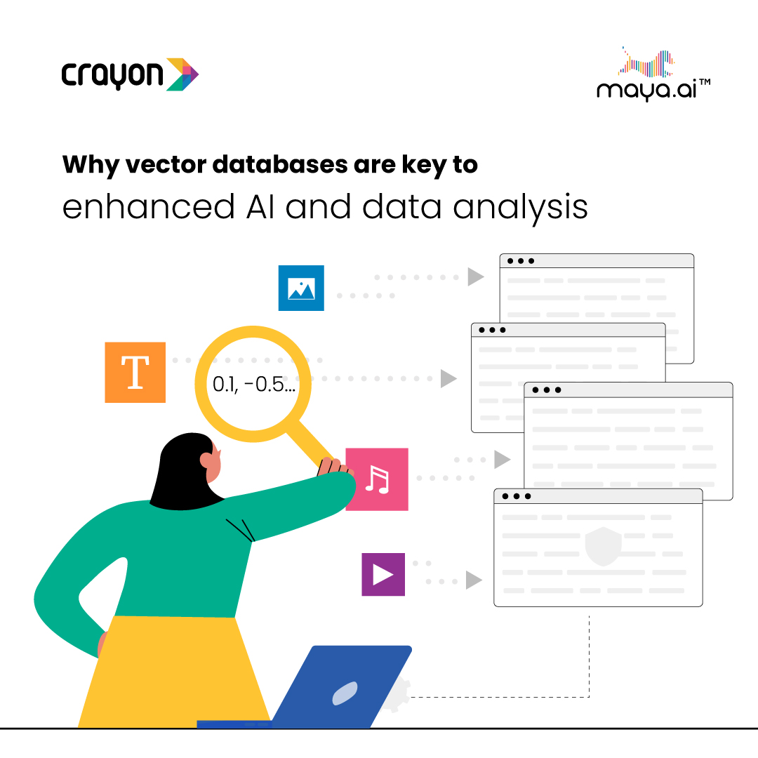
Visual pictures are the friend of the data writer. They take the concept you are describing in the abstract and give it a semi-concrete existence on the reader’s screen. If you write about data and don’t have a quality stock photo source, that needs to change now. Some people have a hard time marrying an image with a piece of data writing because data is so abstract. The thing is, you don’t have to be literal when it comes to data writing images. Think about one aspect of the data in question that touches the real-world experience of your readers. Then use an image that relates to that topic. This is usually more than enough to satisfy readers’ need for a relatable grounding of the topic you’re dealing with.
Write short sentences and paragraphs
Today’s writing is meant to be digested on phones and tablets. Even though we haven’t necessarily followed our own advice in this article, it’s even more important to do this when writing about data. Data writing is typically dense and often appeals only to people with a background in the field written about. For the casual reader, it can be impenetrable. Reach out to this reader by making your sentences short and concise. Explain your thoughts carefully. Make paragraphs short and put adequate space between them.
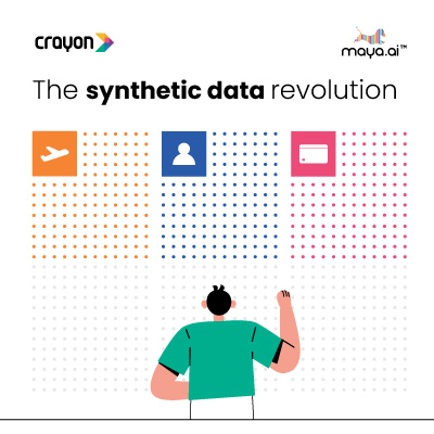
Infographics
Infographics may cause you to dispense with writing altogether. There is no right or wrong way to communicate information, just so long as the information you’re communicating is properly understood. If your information can be more clearly in graphical form than in written form, then investing in quality infographics is the way to go. Infographics are a great way to attract readers. They are friendly and brightly colored. People enjoy using them as a learning tool. They’re a form of storytelling that can make even the roughest data go down smooth.
There are lots of ways to make good data writing happen. Most of the tools at your disposal are classic writing techniques that writers have used to good effect for decades. But there are special tools that are the property of data writers. These tools make complex thoughts digestible to lots of people, who probably wouldn’t get a lot by staring at a data sheet. Here’s to better writing, and to the clear communication of information that you have a specialized understanding of!